BRAND STRATEGY
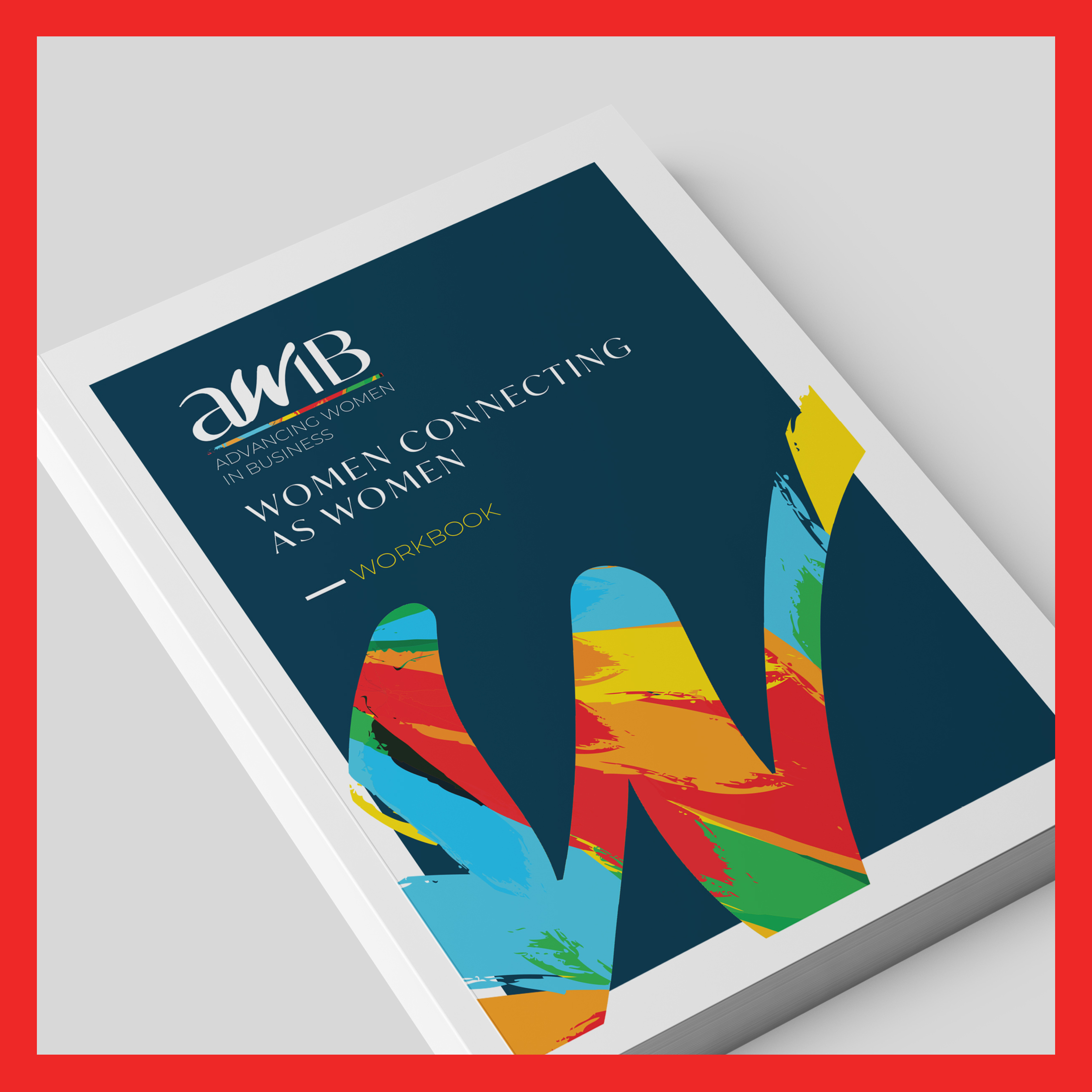
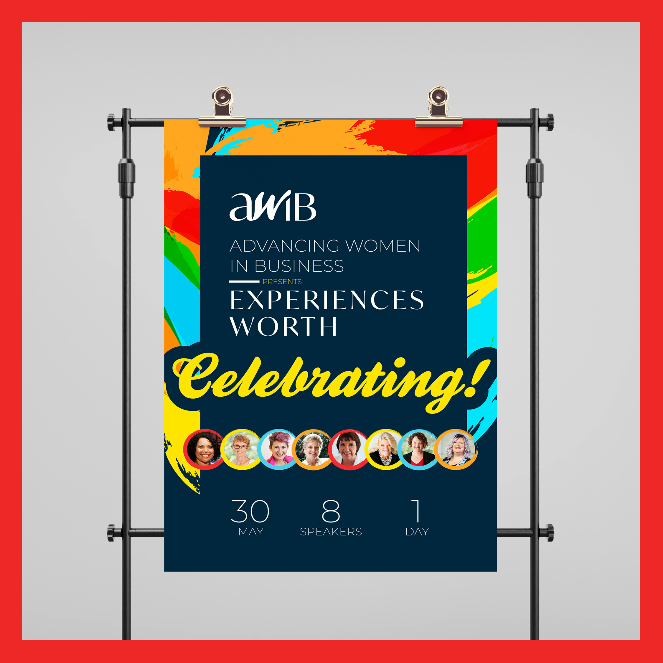
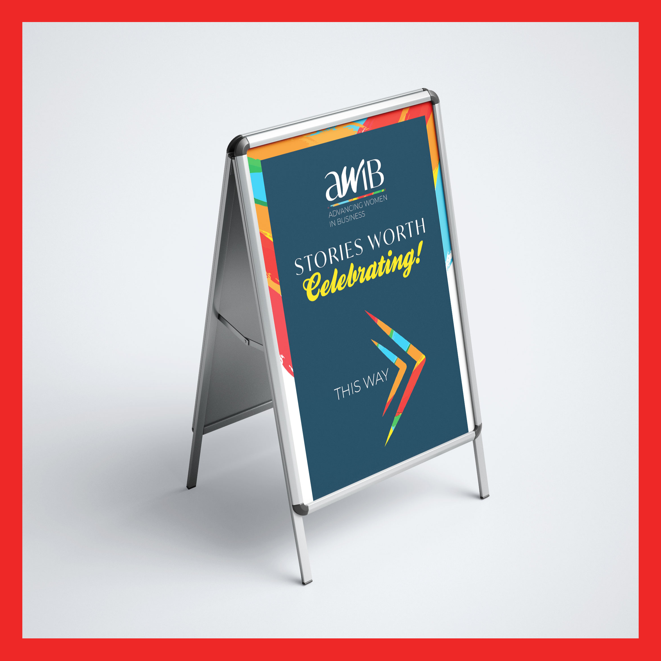
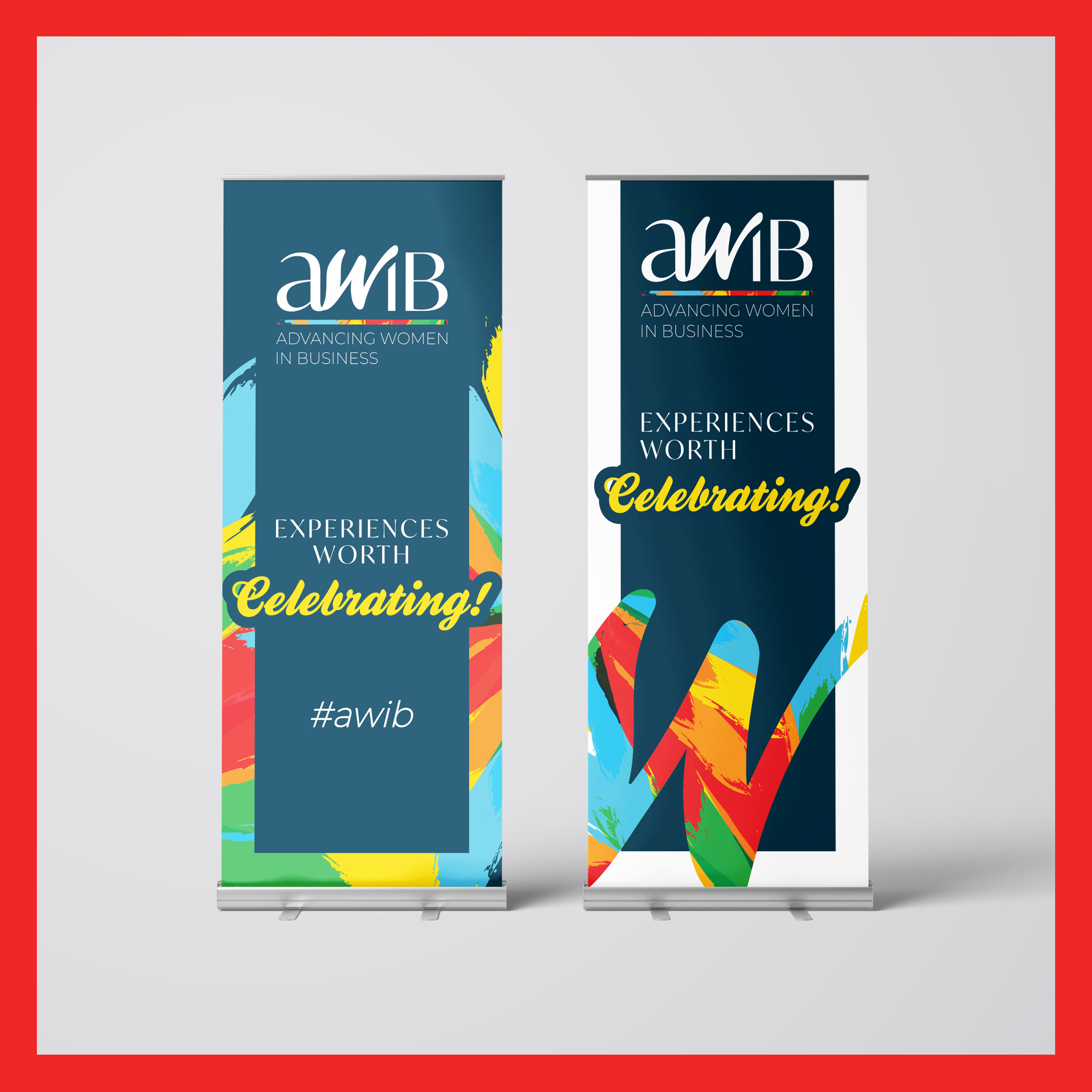
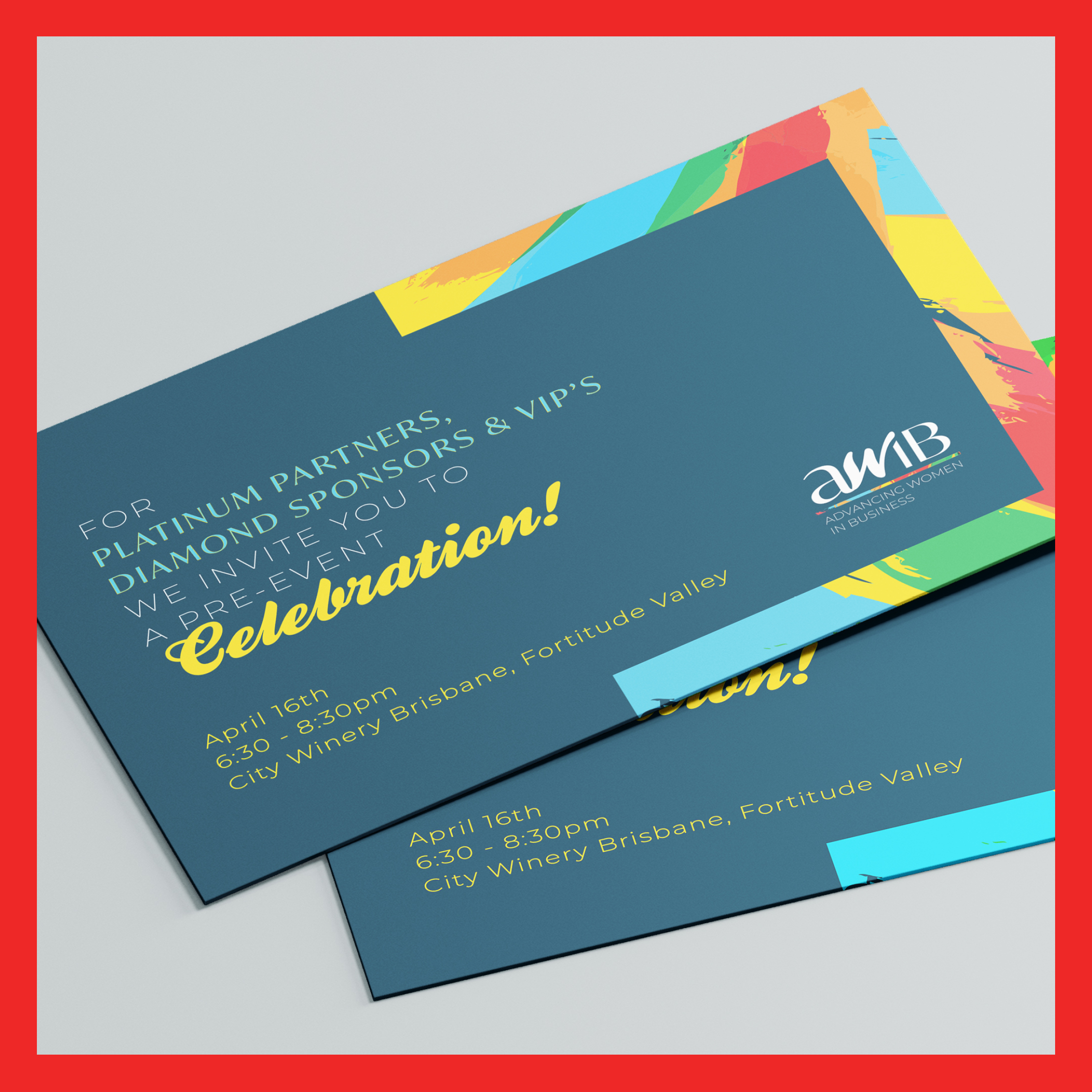
The AWIB (Advancing Women In Business) team approached us seeking to create an identity that aligned with the unique vision and purpose for their new organisation. After spending some time developing their strategy and understanding what they desired from the identity, we came together to create the new AWIB identity including logo and supporting visual assets.
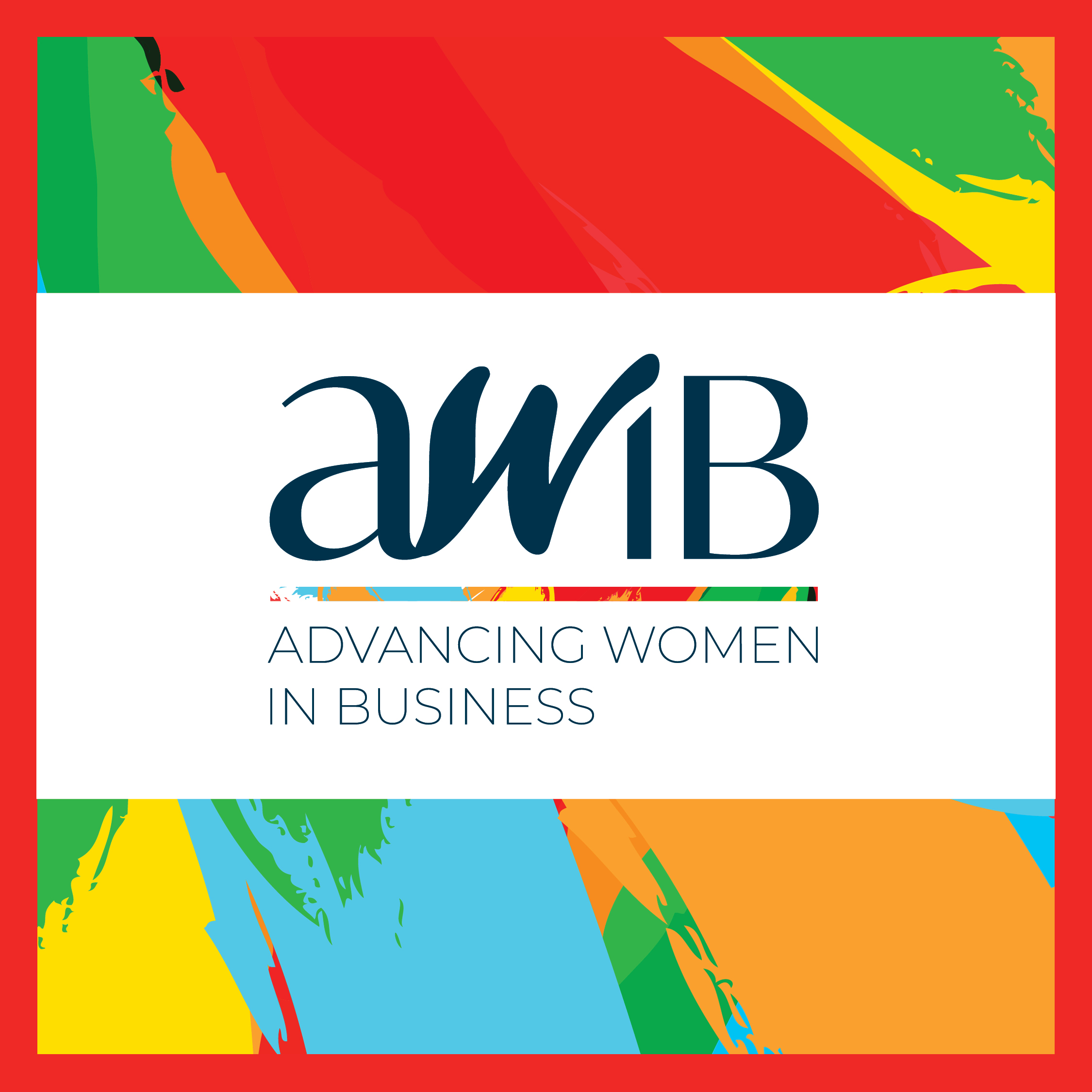
The brief we developed from the initial strategy, required us to design a logo that represented diversity, positive energy, vibrancy and a supportive nature.
We achieved this by using different typography within the abbreviated AWIB letter formation, the W representing Women, as the focal point, with a curvature and boldness that signified a feel of flow, ease and comfort.
The supporting colour palette is where we introduced the feeling of vibrancy, positive energy and diversity. Carefully selecting a palette of vibrant, yet complimenting colours that allowed our identity to pop, create a feeling of excitement and grab the attention of our audience.
